I admit it, week five and I’m already resorting to a bit of a cheat…
First, it’s really not week five anymore – I missed that. Second, while I did do a ton of shooting last week, I decided when I started this that I wasn’t going to piggyback on shoots I was doing anyway; P26 shots should be specifically for P26.
Well, since I’m playing catch-up here, I’m bending both rules and posting a new treatment of an old image.
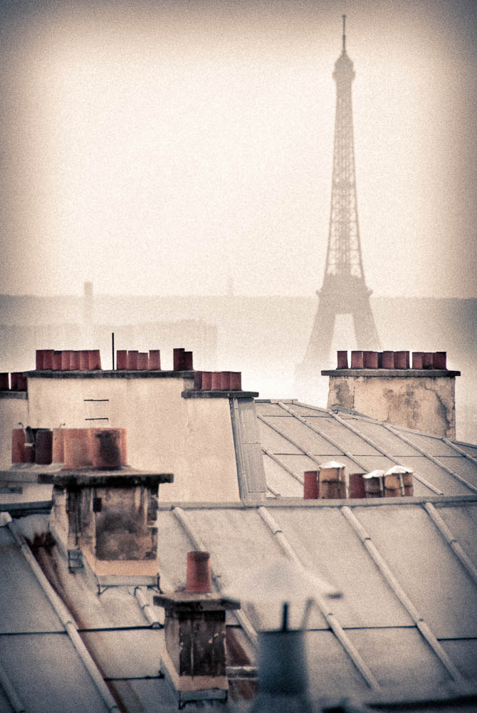
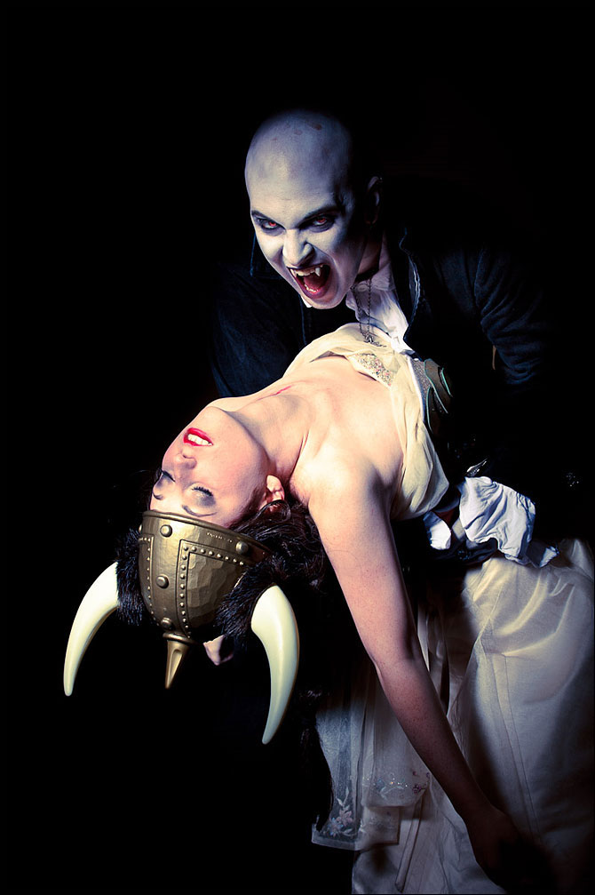
I do a reasonable amount of post-processing, but—other than the obvious exception of all the black and white conversions—I tend to stick to generally representational color: the colors look more or less like they did to the naked eye.
I’ve been branching out and experimenting with different looks lately. The Fresco Opera promos got a touch of a cross processed look (“cross processing” is when you develop color transparency film in color negative chemicals or vice-versa), and I liked how that turned out.
I’ve been using some of my older shots as color-tweaking fodder. This one seemed like a natural fit for something fairly extreme.
Yeah, the treatment is a little trite for the subject matter, but I’d never done this before and wondered if I could make it work. Trite or not, I liked the result, so here it is:


